Are you ready for a change in color that will get you in touch with your softer side? This spring colors are shifting from the intense colors we’ve been seeing to a softer, more soothing palette.
Pale pastels and neutrals from mother nature were stars of the fashion runways are are now all over the market for decorating homes.
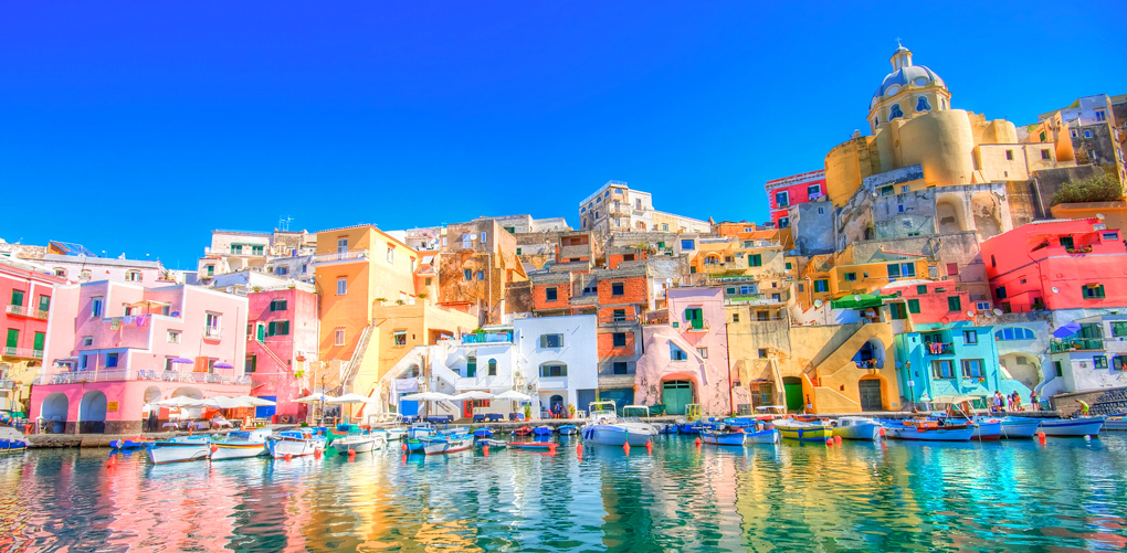 Procida, Italy – The Colors of Spring 2015
The palette is a mix of soft cool hues blended with subtle warm tones.
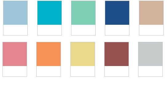 The Spring 2015 Colors are:
1. Aquamarine
2. Scuba Blue
3. Lucite Green
4. Classic Blue
5. Toasted Almond
6. Strawberry Ice
7. Tangerine
8. Custard
9. Marsala
10. Glacier Gray
The two deeper tones included are Classic Blue and Marsala the Pantone 2015 Color of the Year.
This week I’m taking a look at the cooler colors. I hope these ideas inspire you to add these new colors to your decorating.
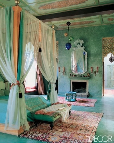
 Armani Aquamarine Blue
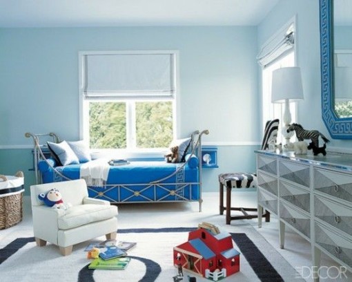 Aquamarine walls with shades of blue
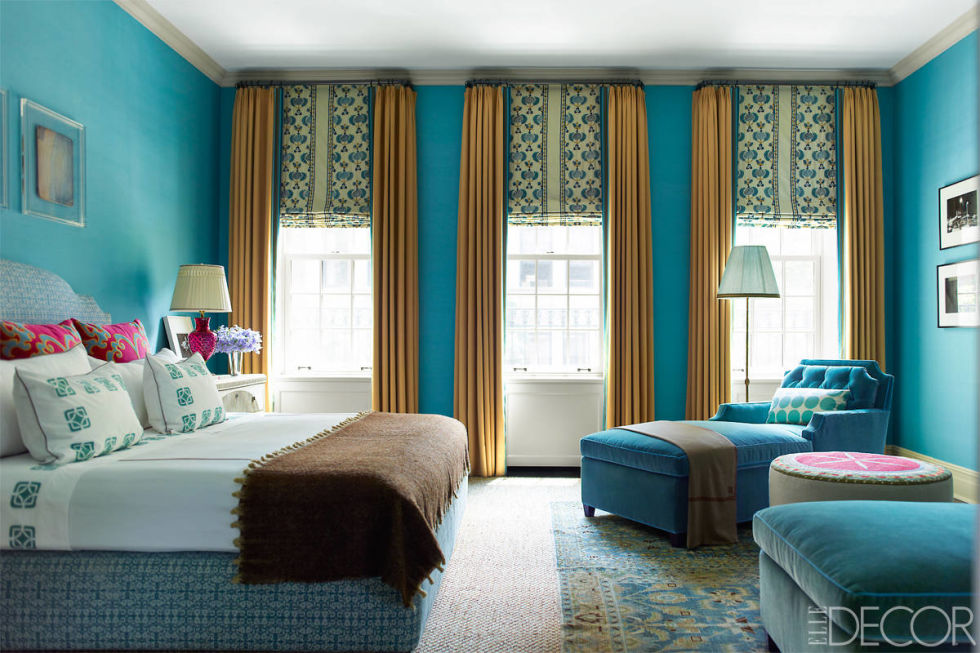 Scuba blue reminds us of the glorious summer tropics
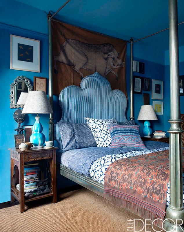 Scuba Blue walls in room designed by John Robshaw
 A contemporary dining room with lucite green chairs
 Lucite green used tone on tone sets a romantic mood.
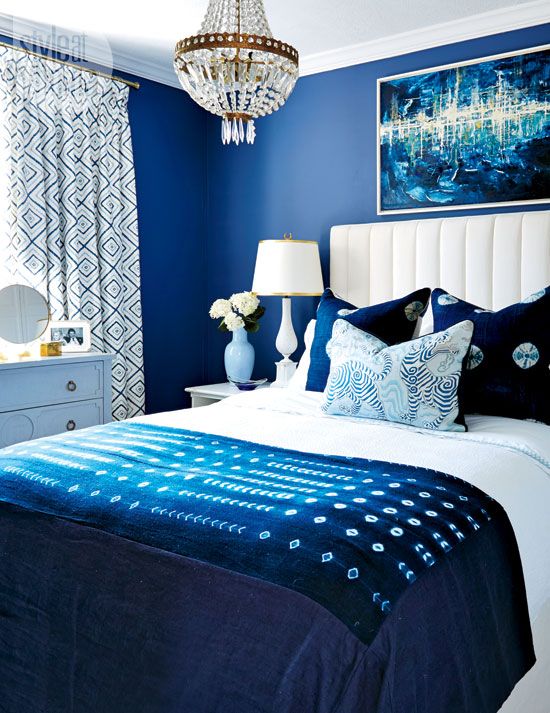 Classic blue is timeless, crisp and beautiful in any room.
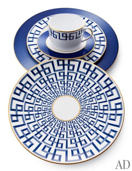
Refresh the table with this place setting in classic blue by Brian Gluckstein.
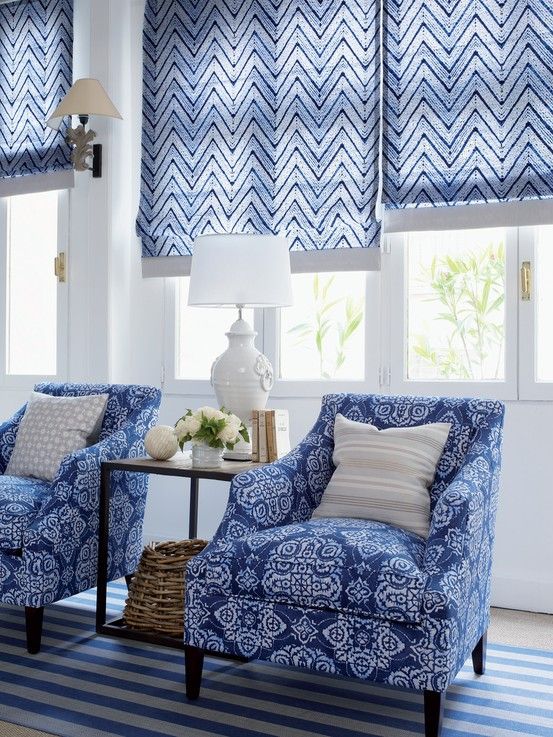 A pattern play in classic blue shows you how to mix it up.
The look was coined “En Plein Air” by the Pantone Color board. “En Plein Air” is a french term referring to painting the outdoors. It’s easy to see the influence of landscapes, water and nature from the cool tones in the spring 2015 color palette.
What a refreshing change from the strong colors that have dominated recently.
So, what’s your impression? Will you embrace the new color options?
Next time we’ll look at the warm tones in the color palette.
Until next time …